01App Architecture Analysis
Our process began with mapping the existing app architecture and identifying usability issues such as unclear navigation, UI inconsistencies, and poor error messages. This analysis helped us understand the areas that required improvement and set the foundation for our design and development efforts.
02User Experience Enhancements
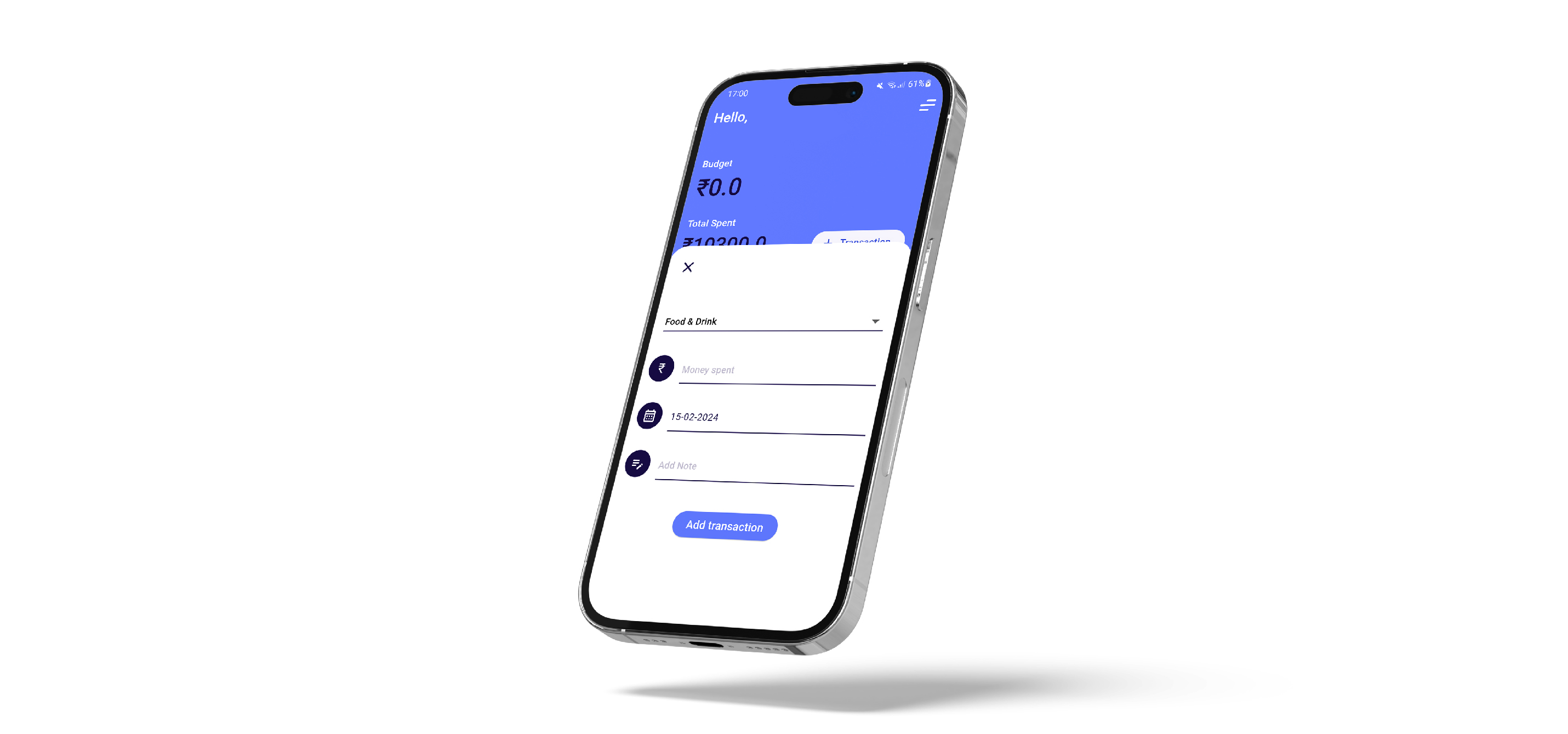
To address the identified usability issues and improve the overall user experience, we added features like reminders to add expenses. These enhancements aimed to create an interactive interface that encourages users to consistently track their expenses.
03Wireframing and UI Design
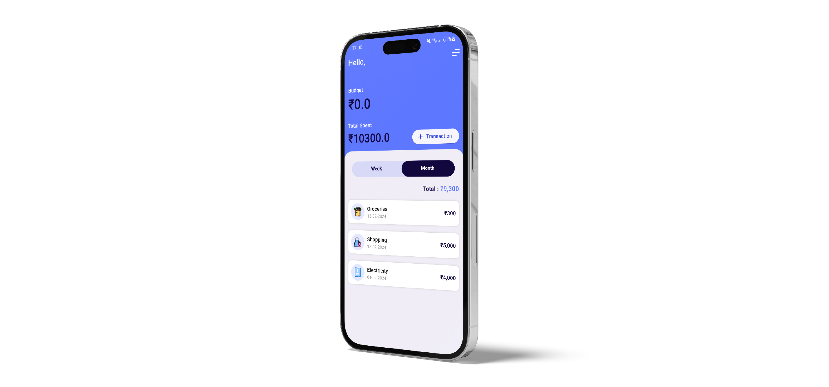
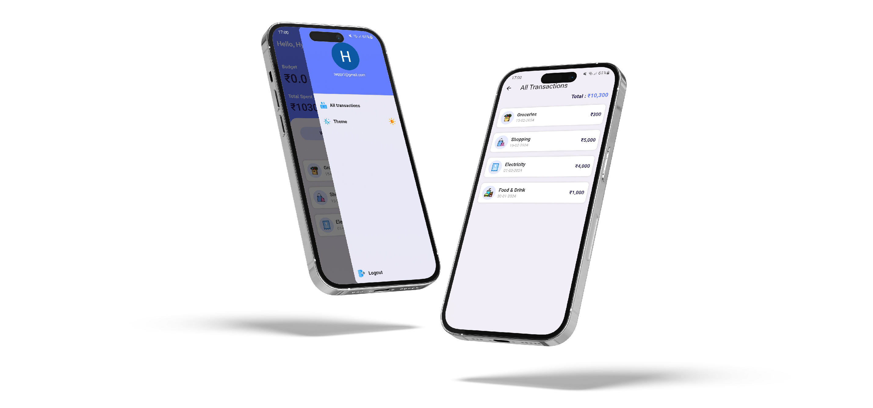
We created low-fidelity wireframes for the expense tracker app's primary features, with expense tracking and management prominently positioned on the home page. We then explored our competitors and designed a UI kit around our competitive advantages while maintaining readability and legibility for all users.
04Branding and Style Guide
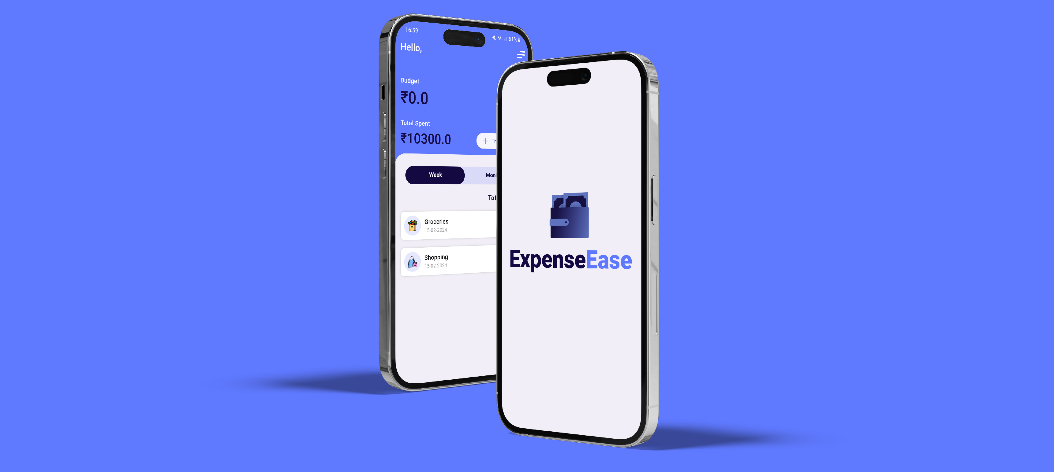
We chose an appropriate color scheme and set up a style guide to effectively position the brand's presence. This step ensured visual consistency and reinforced the app's brand identity throughout the user experience.